In the first two chapters of this Design Diary (chapter 1, chapter 2) I talked about the underlying inspiration for my auction game, Mansion Builder, and the different methods of conducting the auction that I tried.
Today I’m talking about the use of icons on my game cards.
First attempt: All text
When I’m developing a new game, I start with the quickest, simplest prototype I can make (prototype early and often). This typically means that I’ll put some card names and text and numbers into an Excel spreadsheet, print them on regular paper, cut them into slips and insert those slips into sleeves with Magic cards for backing.
This also means that I’m not investing any time in making these cards look good. They need to be functional, but that’s it. They’re black and white (cheaper to print) and they have no graphics. This way, if my initial attempts reveal that my game idea just isn’t fun or it’s completely broken or I’m not inspired to work any farther on it, I haven’t wasted a bunch of time making a nice-looking prototype that I’ll just throw away.
In this vein, my first Mansion Builder cards featured all text with some numbers.
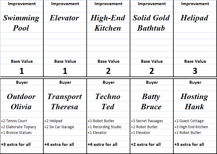 I was happy to discover that the basic game mechanics worked and were interesting. Players were bidding on Improvement cards for their mansions (the top row of cards), and then they were getting money from selling mansions with the right Improvements to the various Buyer cards (the bottom row).
The problem was that I had 12 different Improvements, and it was hard for players to scrutinize the various Buyers in order to tell which Improvements they wanted. With a bunch of cards on the table, the text became overwhelming.
Solution: Icons
I have an intermediate set of icons that I won’t show here because I don’t own the rights to them. These came from simple Google Image searches, and I wasn’t specifically looking for Creative Commons icons or anything like that.
However, I later discovered The Noun Project (discussed a bit in an earlier post), which had all of the icons I needed. The cards now look like this:
![]() I’ll point out that I switched from Excel to Photoshop for this version of the cards, but I did have an intermediate step where I dropped the icon images into Excel.
I’ll point out that I switched from Excel to Photoshop for this version of the cards, but I did have an intermediate step where I dropped the icon images into Excel.
Beyond the icons for the improvements themselves, there are two other things I want to point out. The first is that I’m using icons with numbers for money and reputation/victory points (the “dollar bill” icons on the improvements and the “laurel wreath” icons on the buyers). This makes it clear that there are two different meanings for numbers on cards.
The second thing I want to point out is that there are two different types of numbers now. In the first iteration that you saw above, all numbers were the same – money. I soon realized that it was important to separate money (the stuff that gives players more options during the game) from victory points (the stuff that lets you win the game). I’ll write more about this in a future post, but if you make the power-giving currency the same as the game-winning currency, you tend to get a runaway leader problem.
Next steps
Having icons on the cards has made things much easier, and I’m glad The Noun Project exists (I bought the rights to use all of these icons, which was quite affordable, just a dollar or two apiece). The icons are still black and white, though, which needs to change (being able to tell which icons are which based not just on shape but also on color will help).
Michael Iachini – Clay Crucible Games